Skins
The skin system is PrismQML's signature capability: one component set, multiple design languages.
Skin and theme are orthogonal
PrismQML splits "design language" and "light/dark" into two independent dimensions:
| Dimension | Controls | Values |
|---|---|---|
| skin | design language | fluent / neobrutalism / vintage_ticket / neumorphism |
| theme | light/dark | light / dark / auto |
All four skins support light and dark themes, and the two dimensions combine freely.
Switching skins
from prismqml import Skin, getSkin, setSkin

setSkin(Skin.FLUENT)          # Fluent Design: rounded corners, blurred shadows, blue accent
setSkin(Skin.NEOBRUTALISM)    # Neobrutalism: thick black borders, hard shadows, orange accent
setSkin(Skin.VINTAGE_TICKET)  # warm paper, ink lines, stamp semantic colors
setSkin(Skin.NEUMORPHISM)     # same-color surfaces, paired soft shadows, inset states
print(getSkin())              # Skin.NEUMORPHISM
Visual paradigms
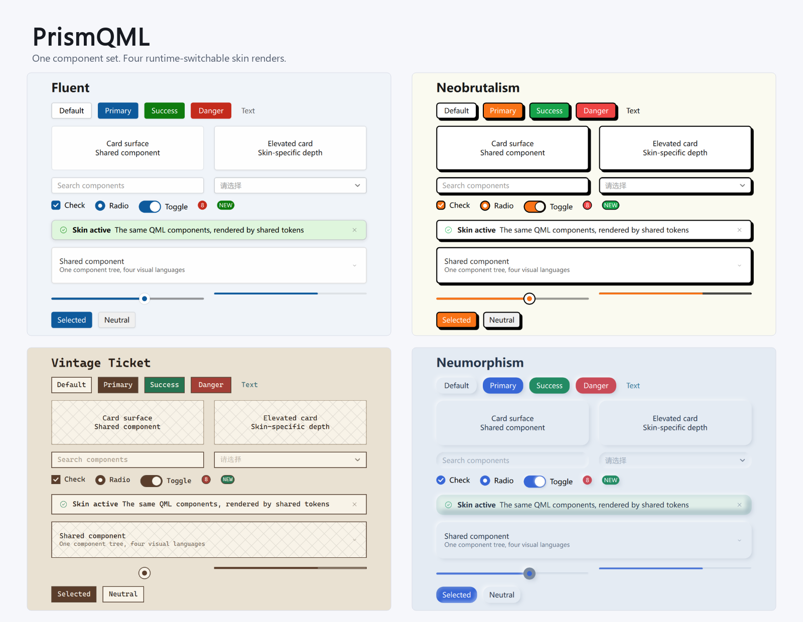
- Rounded corners (small radius / pill)
- Blurred shadows (RectangularShadow, with blur radius)
- Blue accent, semi-transparent overlays for hover/press
- Mica effect
- Thick black borders (2px solid)
- Hard shadows (offset solid-black rect, zero blur)
- Orange accent + high-saturation colors (green/red/amber)
- Buttons "flatten" the hard shadow on press; input focus turns the border orange
- Solid & flat (Mica disabled)
- Warm paper surfaces, aged ink, and stamp-inspired semantic colors
- Square geometry, fine borders, and ticket-like separators
- Monospace typography by default, with no elevation shadow or Mica
- Canvas and surfaces share a base color; paired light/dark shadows create depth
- Raised surfaces, inset inputs, and pressed states use shared tokens
- Borderless surfaces with Mica disabled
Reading the skin in QML
import PrismQML

Rectangle {
    // Controls normally adapt automatically; this only demonstrates public state/tokens
    radius: Enums.isVintageTicket ? Enums.ticket.radius : Enums.radius.small
}
Enums.skin— current skin string ("fluent"/"neobrutalism"/"vintage_ticket"/"neumorphism")Enums.isNeobrutalism— boolean convenienceEnums.isVintageTicket— Vintage Ticket convenience flagEnums.isNeumorphism— Neumorphism convenience flagEnums.neo.*— neo-specific tokens (borderWidth / radius / shadowOffset, etc.)Enums.ticket.*— Vintage Ticket geometry and color tokensEnums.neumorphism.*— Neumorphism geometry, shadow, and color tokens
Local skin scopes
SkinScope changes the design language for only its subtree. It never calls
Enums.setSkin() and never writes the user's global appearance configuration.
Use it for an invitation, ticket, or embedded tool that should look different
from the surrounding application:
import PrismQML as Fluent

Fluent.SkinScope {
    id: inviteTicket
    skin: "vintage_ticket"

    Fluent.Card {
        title: "Invitation"
        Fluent.Button { text: "Copy" }
    }
}
skinaccepts the same four values as the global setting; an empty string follows the nearest parent scope.- A scope inherits the global light/dark state and base accent, so it updates when the application theme changes.
- Card, Button, Label, Separator, TicketPaper, DialogBoxCore, ContentFrame, PopupWindowCore, and button dropdown menus use the nearest scope automatically.
- A popup or dialog declared outside the scope can receive its read-only context explicitly:
context is only for cross-parent or cross-window handoff. Ordinary pages only
need SkinScope.
Architecture: token-driven, skins decoupled from components
Skin switching is not done with if neo in every control — differences are collapsed into the token layer:
- Colors via
Theme/StateColorand the active skin palette - Geometry via
Metrics(radius / border / shadow) - Accent:
Enums.accentColorresolves to the active skin's primary color
Components are nearly skin-agnostic. New skins primarily add a token palette and only use structural branches where shadow or interaction geometry requires one.
Light and dark palettes
All four palettes react to Enums.isDark. Dark neo uses a charcoal background,
brightened accent, and light hard borders; Vintage Ticket switches to dark paper
and light ink; Neumorphism keeps same-color surfaces while adjusting both shadows
and text contrast.